
Countdown Formatting
I revisited the countdown portion of a Dashboard yesterday, and would love to clean it up a bit.
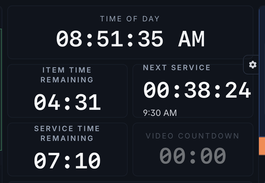
Some of this is from auto-sizing and line wrapping, but if I could have the time directly below 'Next Service' then the look would be more consistent with the other countdowns.
Then, in my "Video Countdown,' forcing the words to stack would push that countdown to align like the rest.
But then formatting countdown times and/or the block they live in, by choosing colors, would help separate them for my quick glances.
Completed
Hey Shawn! We polished this up a bit. Let me know how this is feeling for you. We'll continue to work on this until it feels right.